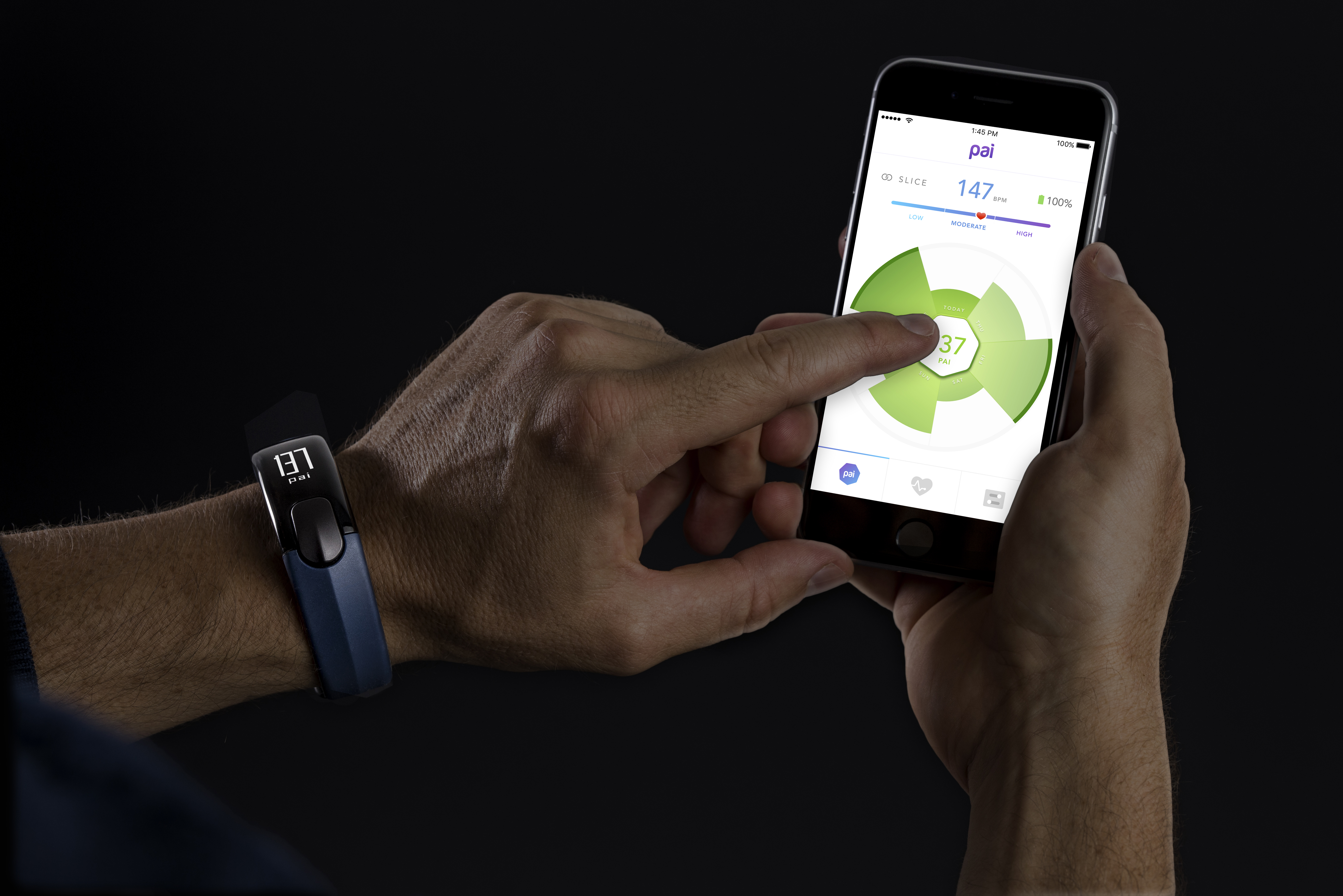

PAI is a new approach to activity tracking that represents your fitness with one number. I worked on PAI's app with the Woke team from inception to release and beyond, first as a product designer focusing on UX and concepting new features, and later as lead designer. In the later stage, I worked closely with PAI to set requirements, manage design work, and support developers as we released new updates.
I was also the main designer working on the interface for the accompanying Slice wearable, which won a 2017 Red Dot Product Design award, and was named "Best of CES" by the Wall Street Journal, PC Magazine, and Men's Health.

PAI stands for Physical Activity Intelligence. Your PAI score is calculated using your heart rate, activity level, and demographic data like your age and gender. This means it’s personal to you, but it also means that all physical activity counts – not just steps. You earn PAI by doing any activity that raises your heart rate, whether it's running, yoga, swimming, gardening, or anything else.
The PAI algorithm is based on research from the HUNT study at the Norwegian University of Science and Technology, one of the world's largest health studies.
The goal is simple: if you can keep your PAI Score above 100, you'll reduce your risk of heart disease and live up to 5 years longer.
In a rush, we released the first version of PAI to real users ahead of CES 2016. At this early stage, some features were missing and others still needed refinement - but the feedback we received from early users and reviewers was invaluable.
In particular, the Activity Setter seen to the left was a prominent element. We intended it to encourage users to set short term PAI goals and teach about how workout intensity affects your PAI score, but most users found it confusing.

With user feedback in hand, we began setting requirements for PAI 2 - the version that would launch alongside the Slice wearable.
Rather than getting users to play with a goal setter to learn about intensity, we decided to emphasize livestreaming data from Slice so that users could see the effect of more intense exercise in real time. Other goals for PAI 2 included a visual overhaul and UX refinements for a lot of behind the scenes tasks such as Notifications, Insights, and Alarms.
Below are some of our concepts for communicating the relationship between intensity and PAI points, livestreaming, daily goals and future features like social teams.


We scheduled celebratory notifications to reinforce positive moments during the day. By displaying an actionable notification, we give people an easier way to dive deeper into the PAI app and review their successes in detail.

Abandoment is a serious issue for all wearables - most are left in a drawer after around 3 months. We created notifications and triggers to target the moments where people were most likely to stop using Slice.


Geoffrey Fowler, The Wall Street Journal

Timothy Torres, PC Magazine

Software and Hardware
The point of designing the software and the hardware together is that you can design flows that include both, instead of each side making assumptions about the capabilities and limitations of the other side. This is really crucial in things like device pairing flows where missed opportunities or onerous technical requirements can create a disjointed, long, or just plain buggy experience. This was a huge advantage for us at Woke, with user experience and industrial designers sitting side by side. I was able to work on both the Slice firmware and the app, making sure the experience was harmonious.
Refine when you get the chance
When the developers are slower than the designers, take the opportunity to refine your designs. The best time to make adjustments is before it gets coded, not after. This is especially true for pixel-perfect visuals - it's a huge pain to convince product managers and developers to prioritize fixing miniscule non-funtional bugs, and you won't even learn much from putting it in the hands of real users.
Product Requirements
Work closely with product managers and developers to set requirements. It's important to know why certain product decisions were made, and therefore when it's time to rethink a requirement in light of new information. It's also important to back up your ideas with concepts that show why the extra development effort and design time is worth it to create an improved experience. Moreover, if you understand the business's needs and goals, you'll be able to craft a product strategy to meet those needs with everyone on board.
Consultant vs Internal Design Team
On the other hand, there's only so much you can do as a consultant. You make your best recommendations, but sometimes the internal team decides to take a different direction and you need to accept that. Depending on the services agreement, it might not be possible to have a say in high level strategic or product decisions. If you really, really want to fight for the best possible experience from beginning to end, you should probably just join the client as an in-house designer.
In Spring 2017, the PAI App and accompanying Mio Slice won a Red Dot Award for Product Design.
I led the design of PAI Health's Apple Watch app, which lets users see their PAI score throughout the day and track their heart rate and intensity levels as they work out.
More ➝I worked with FTSY to design a 3D measurement interface for their app, which helps users find shoes with the perfect fit.
More ➝