Building From The Ground Up With New Design Tools
April 10th, 2019
9 min read
Last night I read Kilian Valkhof’s post “What Design Tools Get Wrong”, and tweeted at him about how much I liked it. When he asked me to expand on my thoughts, it crystallized quite a few things I’ve been thinking about lately.
Looking at design tools through the lens of a freelancer and agency designer who has often had to build apps and design systems from scratch over a short period of time, I think I have a unique perspective on how new design tools can support the creation of totally original designs, instead of primarily the expansion of existing products.
Starting with flows
Ideally, I’d be able to start with a tool that lets me reference requirements and turn them into screens and flows, probably similar to existing flowcharting software. This lets you start by thinking about the functionality you really want, and worry about visual manifestations of that functionality later on.
Since every user action is associated with some kind of state change or navigation, connecting a screen to alternate states or other screens could generate a checklist of affordances to include on each screen, and flag inaccessible states. From there you could populate the screens with pre-made stateful components that have actual interactivity, so you could play with working flows at the wireframe level pretty quickly.
This flowchart stage could remain as the primary source of truth for navigation. If you want to rework the flow and add or remove steps, you’d do it there, with a full understanding of what other screens and states your changes affect.
It may seem like a small issue, but it’s a real pain in the butt to generate app maps that show how all your screens interconnect. Whenever you remove or add screens, big chunks need to be rearranged and all the little flow arrows need to be moved manually. A tool that actually understands how users flow through an app could make this a lot easier.
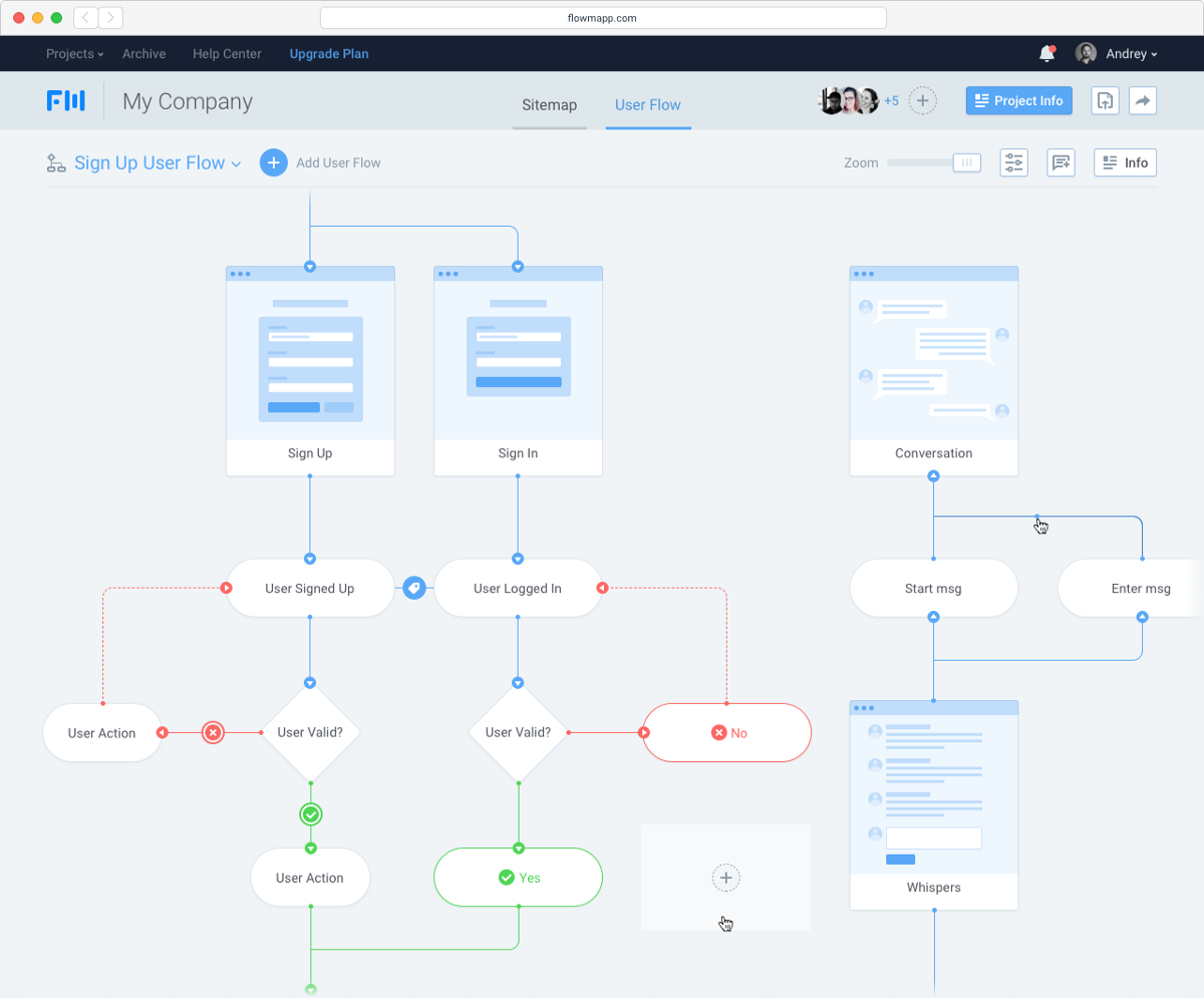
Flowmapp, a user flow planning tool
Smooth transition from free iteration to a formal system
When working on early stage products, very little is defined, so working on screen design and system design in parallel can be clunky and disruptive to your flow. You want the freedom to try out iterations at will, make fast changes, and move things around without committing to restrictions too early. But at the same time, some attributes of design system tools can actually be useful in adding the right amount of structure where appropriate.
Use an existing kit
One simple tactic that I already use is to create stock placeholder components that already have some built-in structure. You can use a library for this, but keeping your own library of design patterns makes it easier to keep and reuse things that work for the kind of problems you find yourself solving often. Having a pre-made kit lets you do basic wireframing really quickly by clicking together existing blocks. Later on, these components can be customized to the project as necessary.
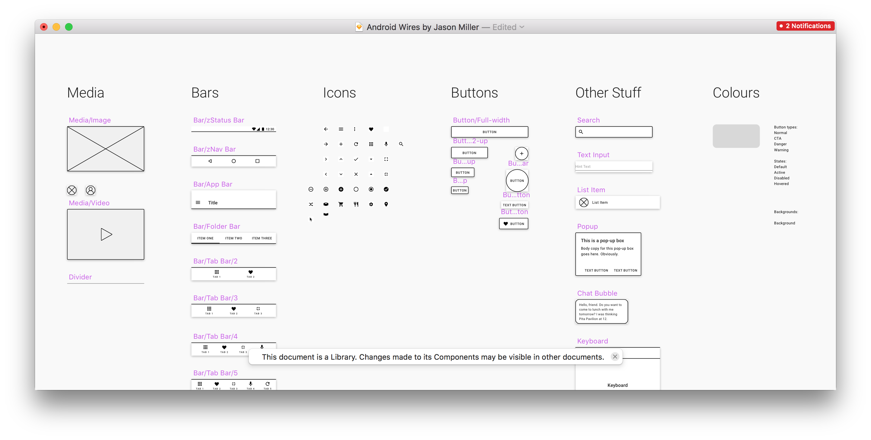
One of my personal wireframing kits. A work in progress :)
Turn off the system at will
Another way would be to create separate spaces for structure and for play. I often find myself considering making changes to a component, or splitting one component into two — but first I need to explore a few different ways of doing it before I can commit to a solution. In my existing workflow, I often duplicate a screen, drag it off on its own somewhere, and detach all the symbols and styles from master before iterating. Otherwise, my own iterations will be overwritten the next time I push a change to the master style — or if I mis-click, accidentally overwrite the master style with one of my weird experiments.
Imagine if you could take a screen you’ve been developing and enter a kind of free-exploration mode where some of the normal structure doesn’t apply. Elements that were originally associated with colour or type styles could be temporarily freed from that association, letting a designer play around with the parameters of a component and create several variations without having to worry about affecting the original source styles.
Resizable components
Another thing would be to make components responsive and resizable in the design tool. If I have a stack of components onscreen, changing the height of one should reposition the others. Early in the design process, things will get resized a lot, and we shouldn’t have to manually reflow every screen with every change. Right now in Sketch, you can’t even change the size of a symbol properly — the height of the master symbol will change, but any manifestations of that symbol that already exist will keep the same dimensions, distorting the content inside. Of course, the web already works like this. It’s just design tools that don’t. Fixing this would necessitate a wholesale change away from absolute coordinates to the more flexbox-like approach of Webflow or Modulz.
A step further would be to separate screen composition from styling in the workflow. At the wireframing stage, a designer could specify what components are present and how they are laid out, without specifying more than very rough dimensions for any given component. This might look kind of like Lego, and work like a kind of visual markup. This could define the structure and content of the screen, while reflowing in response to component-level changes in the size of elements onscreen. In practice, it might work a lot like Jon Gold’s Markdown to React project, except with a visual frontend and a palette of component and layout primitives instead of a Markdown file.
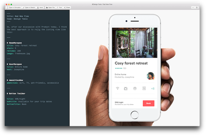
Markdown to React by Jon Gold
Wrapping technical constraints in designer-friendly packages
It’s important that design tools reflect the reality of how those designs get developed. If it’s too easy to design things that are hard to build or vice versa, our tools are only widening the gap between design and development. That’s why tools like Webflow are so great — because they provide an easy to use interface for the same variables that the actual production components are made of.
In my opinion, those type of interfaces aren’t always as easy to use as they could be. It feels like they’re still too tied to how we write CSS — building to fixed specs rather than exploring what those specs should be. In a lot of cases, new design tools are being built by designers with an extremely strong grasp of code, and as a result the tools rely too heavily on a coding mindset. We could do more to bridge the visual layout mindset of most designers with the more rigorous specify-with-text approach of developers.
Make play easier
As a result, many of these tools still require a lot of typing values in text boxes — something less visual and more prone to human error. Something like a notched slider would be better — letting designers play and visualize the spectrum of possibilities in real time, while still pushing towards quantized values that are defined as tokens in the style guide. Leaving room for visualization and play is something Bret Victor demonstrated wonderfully in Up And Down The Ladder of Abstraction all the way back in 2011.
Or, even better than making designers play with sliders to find something they like, you could have a little button or key command that would bring up a visualization of what things might look like at a whole range of values. That’s what Jon Gold’s Rene tool does: visualizing the multidimensional possibility-space that occurs when you want to evaluate more than one parameter at once.
Rene by Jon Gold
Designing with context
Many designers aren’t natural systems thinkers — but they’re brilliant at tweaking what’s in front of them until it looks and works right.
Just as Polypane and Modulz show multiple screen sizes to help you understand the responsiveness of your designs, a component editing UI should also include multiple states or even snapshots of where that component is currently used in the design. Rather than viewing the component on its own, you can edit seeing it in context.
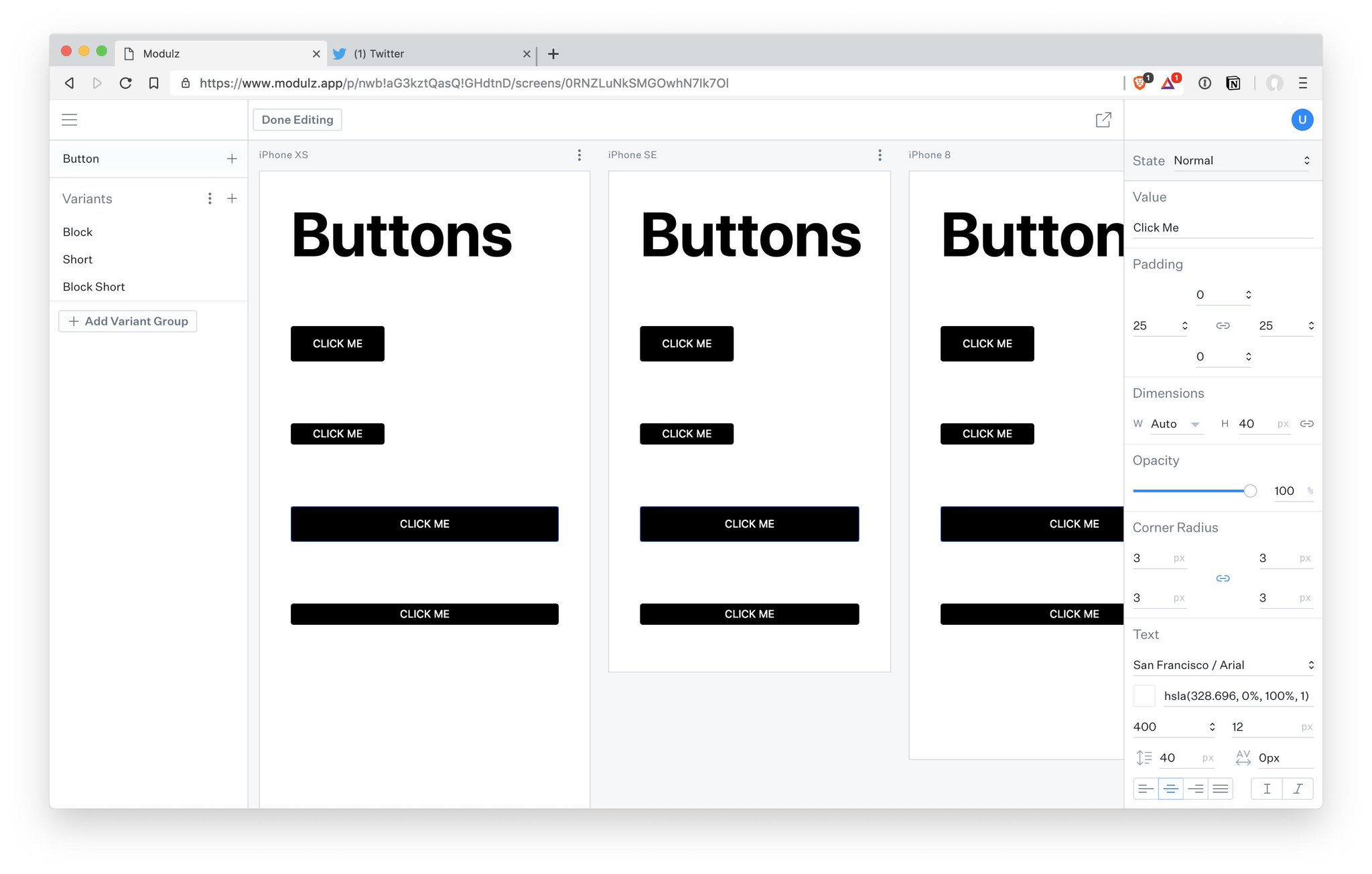
Modulz showing responsive designs across multiple screen sizes
Additionally, components should be interactive in the interface where you build them — you should be able to hover and click on buttons, type in input fields, and drag things that are draggable — or at least make it easy to enumerate and specify comprehensive hovered, pressed, mid-drag, empty, filled, and error states.
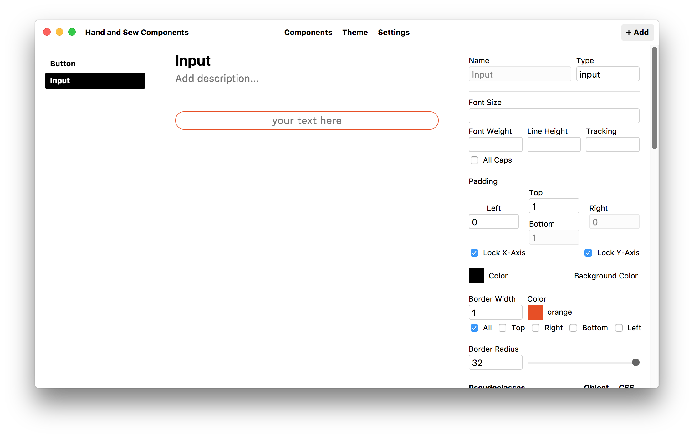
Compositor’s Lab doesn’t let you interact with the components you create :(
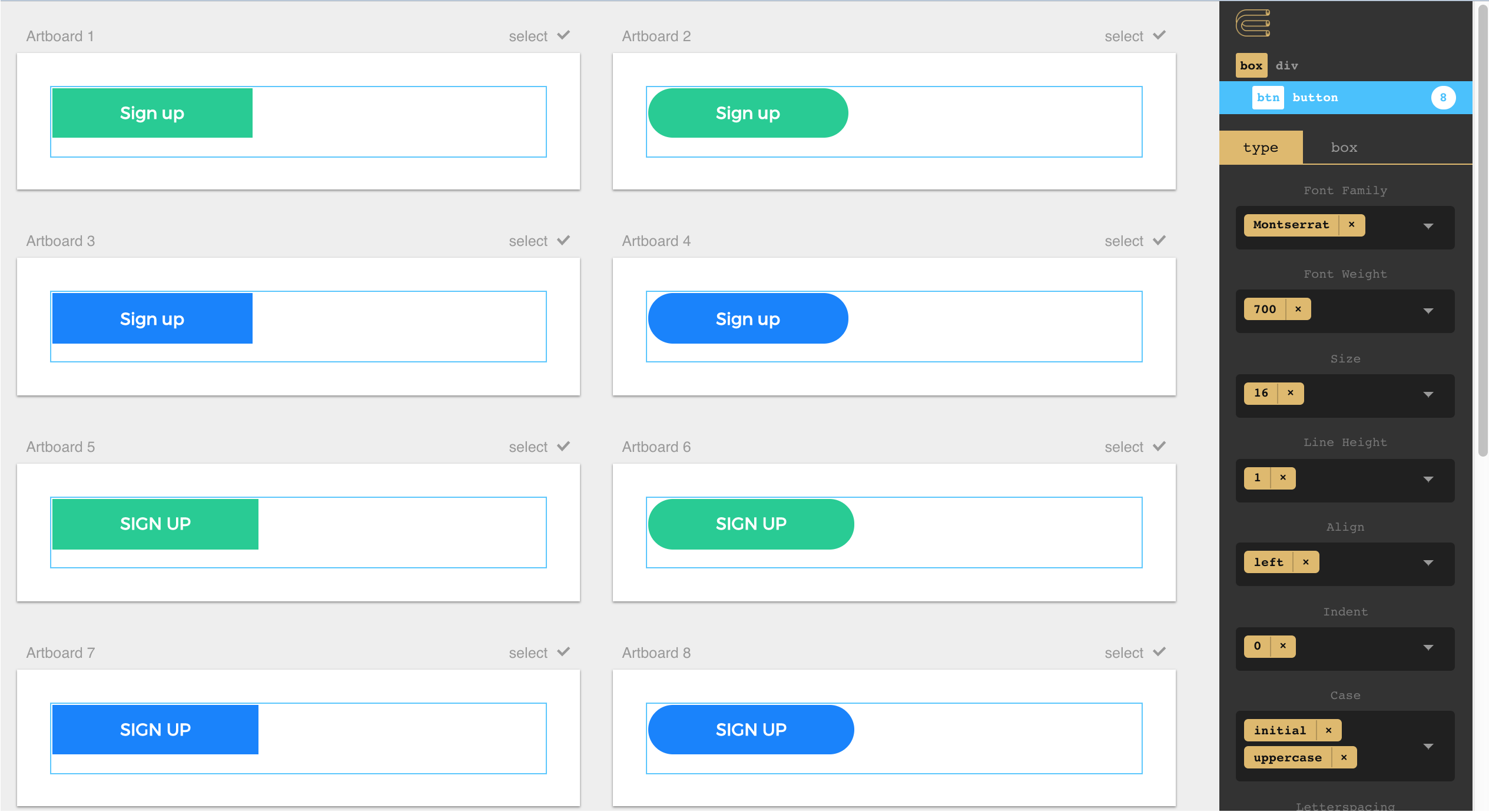
Stateful Type and Colour Styles
Just as components can have multiple states, type styles should be able to have states, too. Imagine that you’re using 24pt Helvetica for headings throughout a product. You’d probably consider it to be one type style — you want the typeface, weight, leading, and tracking to be the same everywhere that style appears.
But once 24pt Helvetica is used in many places in the UI, you’ll probably end up with a light colour, a dark colour, and a handful of highlight colours as well as versions aligned left, centre, and right — so you can easily end up with 15 different sub-styles just to cover all the different contexts. If you decide to bump the headings up to 26pt type, you should be able to change all of those sub-styles at once instead of needing to repeat the same change 15 times without making a mistake. And if you want to make a change to your evolving design system, you should be able to break some of them out into top-level type styles in their own right.
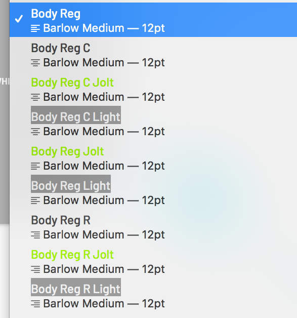
These should all be variants of the same style!
The same goes for colours — it’s common to have a handful of main colours and a whole range of tints as supporting colours. You shouldn’t need to create 10 separate, unassociated swatches to represent a primary blue and a range of tints, you should instead be able to establish a primary colour and choose a system for deriving the tints automatically. Making a change to the primary colour would tweak all of the tints as well. A proper, global system for generating tints from ramp values would also make it possible to swap tints with very little design impact — red-60 would have the same perceived contrast value as blue-60.
Lyft’s ColorBox is one example of this type of approach. Rather than picking colours themselves, you play with parameters for how a series of colours will step through the colourspace, defining start and end values for hue, saturation, and luminosity. It’s all a little bit esoteric, but the idea that a range of tints can be visualized as a line traveling through a cube is pretty cool to me. In my opinion, ColorBox is a little too connected to math and color theory, and not connected enough to the real life use case of establishing a color palette. The ideal tool could let designers lock certain colours in place and interpolate other colours, and would be smarter at using easing curves that reflect how we perceive colour instead of how computers generate it.
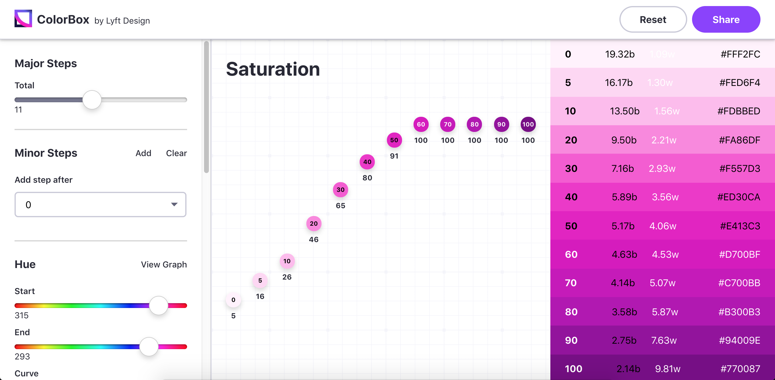
ColorBox.io by Lyft
Someday...
The process of conceptualizing new products and interfaces is one of the mist exciting areas to be working in design. I hope someday we’ll be able to take solutions to all of these problems for granted as part of our workflow for creating new things. Until then, a lot of great work is on the horizon, happening in a slightly more fragmented way.
Thanks to Kilian for inspiring me to write at so much length about this!
If you want my help building the design tools of the future, please reach out at hi@jasonroymiller.com :)